
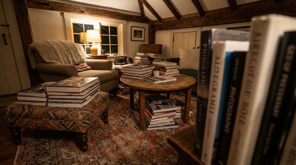
My client’s apartment clocked in at 287 square feet. She had fourteen coffee table books — art monographs, mostly, a few architecture titles, two oversized Taschen volumes that were basically furniture at that point — and she wanted all of them visible. First time I walked in, I counted three stacks on the floor, two on the ottoman, and one shoved under the sofa like it had done something wrong. The room looked like a storage unit that had aspirations.
That job taught me more about small-space book styling than any project I’d done in a standard-sized room, because the margin for error is essentially zero. You can’t hide a bad decision behind square footage you don’t have.
The stacking math nobody talks about
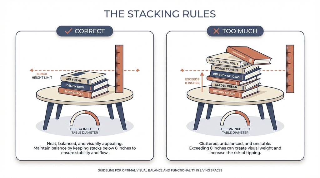
Three books maximum per stack on a coffee table under 24 inches in diameter. I know that sounds arbitrary, but it’s not — it’s about visual weight relative to clearance. When I pushed past three on her 22-inch round table, the stack started reading as storage rather than styling. The human eye categorizes “stack of stuff” differently from “intentional arrangement” somewhere around the four-book threshold in tight spaces, and once you’ve crossed into storage territory, the whole room feels smaller. There’s no recovering from it without removing books entirely.
The height ceiling matters too. Keep stacks under 8 inches. Past that, your eye starts tracking the vertical interruption instead of moving around the room, which kills the spatial flow small rooms depend on. I measure this with a tape now, which looks fussy but saves me from the eyeballing error I made early on where “looks fine” turned out to be 10.5 inches and made a 270-square-foot studio feel like a hallway.
The oversized book problem is actually a placement problem
For years I treated large-format books — the 13×17 Phaidon titles, the Taschen monographs — as a liability in small rooms. I’d recommend clients sell them or store them vertically in a bookcase. That was wrong, and I figured it out embarrassingly late.
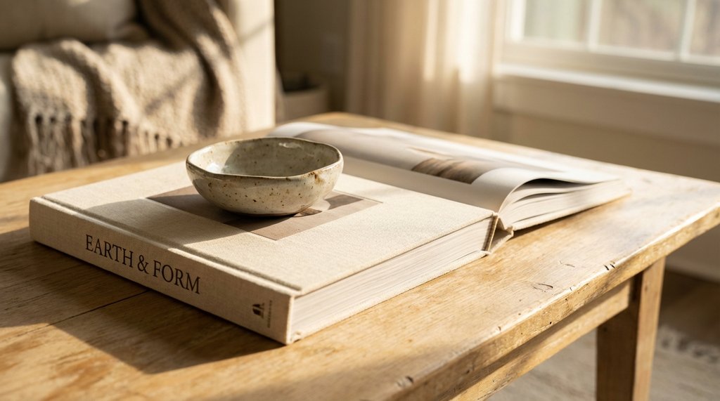
One oversized book, laid flat alone as a base layer with a small object on top, reads as an intentional surface rather than clutter. Two oversized books stacked together in a small room read as clutter immediately. The distinction is that a single large book anchors objects; two large books compete with each other for dominance and neither wins. What I’d been doing wrong was treating all oversize books as the same problem when the actual variable was whether they were functioning as surface or as collection.
Her two Taschen volumes — one went under a small ceramic piece on the coffee table, and the other ended up on the windowsill as a display base for a single potted succulent. Neither reads as a book in the traditional sense anymore. They’re furniture. The room lost two books from the visual clutter count without losing any books physically.
Negative space is load-bearing
The instinct in small rooms is to use every surface efficiently, which usually means filling it. Coffee table styling in under-300-square-foot spaces requires doing the opposite. I leave at least 40% of the coffee table surface bare — not as a style preference but as a functional necessity. That empty surface is what makes the styled portion legible.
When I first started doing this I’d fill that clear space back up within a week because it felt wasteful. The client would add a remote, a coaster, a candle. Everything has a functional reason to exist. The problem is that 40% clearance that felt excessive when I left is load-bearing for how the room reads. Once it fills in, the styling disappears and you’re back to managed clutter.
I now tell clients explicitly: the bare space is the design, not a placeholder waiting to be filled. It’s a harder sell than it sounds.
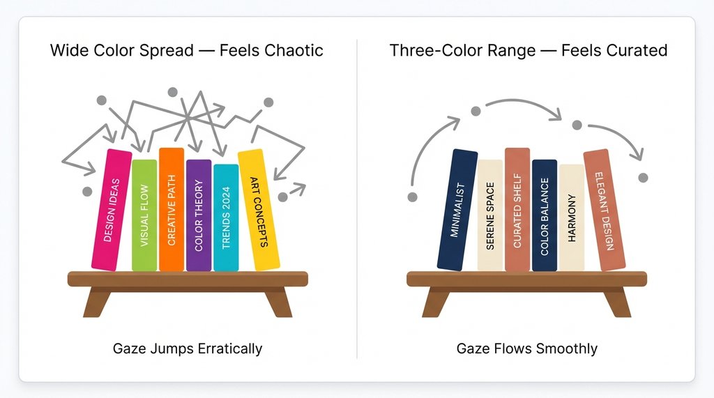
Color editing is more important than quantity editing
Most advice about books in small spaces focuses on how many to have out. The number matters less than the color spread. I had a project — 310 square feet, technically over the threshold but same spatial logic — where the client had seven books on display and the room felt chaotic. Replaced two of them with books in a tighter color range, kept the same seven out, and the chaos resolved.
The reason: a wide color spread across books forces the eye to jump and restart multiple times while scanning the surface. In a large room, that movement reads as visual interest. In a small room, the same movement reads as disorder because there isn’t enough surrounding space to dilute it. Limit displayed books to a three-color maximum — neutrals, one accent color, white spines — and you can get away with more books than you’d think.
Her fourteen books ended up displayed as a rotating system: five out at a time, all within a navy/cream/terracotta range because that matched her sofa. The other nine lived in a low credenza drawer. She rotates them seasonally. She misses none of the ones in rotation because the ones on display actually look like they belong there now.
Where not to put them
The floor stack is the most damage-efficient mistake in small-space book styling. A floor stack adjacent to a coffee table reads as overflow — it signals that the table ran out of room, which makes the whole space read as undersized and overfull even when neither is technically true. I’ve seen this kill an otherwise well-edited room in 400 square feet that had nothing wrong with it except one floor stack.
I tried floor stacks as a deliberate styling element in one project after seeing them work in a loft I followed on Instagram. The loft was 1,400 square feet. In 275 square feet, the same treatment looked like the movers hadn’t finished. The scale transfer doesn’t work. I pulled the floor stack within a week.
The other location problem: books on surfaces behind the sofa. Bookshelves behind a sofa in a small room are fine — they read as architecture. A stack of coffee table books on a console behind a sofa reads as staging that ran out of primary surface. It draws attention to the room’s limitations rather than away from them. If books need to live behind the sofa, they want to be shelved vertically and uniformly, not styled.
The rotation system is the actual solution
Five books maximum displayed at once is where I’ve landed after enough small-space projects to have data on this. Below 300 square feet, five is the number where books read as a curated collection rather than an accumulation. The client with fourteen books was not going to get rid of them, which was fine — she didn’t need to. She needed a system that made nine of them functionally invisible and five of them genuinely visible.
The rotation itself becomes a ritual, which is something I didn’t anticipate when I started recommending it. Clients who rotate their display books seasonally end up more attached to the individual books because they’re actively choosing them rather than just tolerating the stack that’s always been there. That’s not the reason to recommend the system, but it’s a real side effect.
The physical mechanism matters. The books that aren’t on display need a designated home that isn’t “stacked somewhere else in the living room.” A drawer, a closed cabinet, a box under the bed — it needs to be genuinely out of sight, not just relocated. I specify this explicitly now because twice I’ve set up a rotation system and returned to find the off-rotation books in a stack behind the door, which defeats the entire point and makes the room feel more cluttered than before because now there are two distinct book zones competing.
One thing that actually surprised me
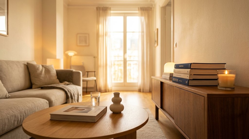
The single most effective change in her room was removing the coffee table books from the coffee table entirely for two weeks and putting them on a small tray on the credenza instead. I did this as a temporary measure while we figured out the arrangement, not as a recommendation.
The room immediately felt 15% larger — her words, not mine, and she said it within twenty minutes of the change. What had been happening was that the books on the coffee table were interrupting the primary sightline from the sofa to the window. Moving them to the credenza (which sits perpendicular to that sightline) preserved the books’ visibility while removing them from the visual path the room needs clear to feel open.
She kept them there. The coffee table now has one book, flat, with a small object on top, and a clear glass of water. That’s it. The credenza has four books in a low stack with a candle. The room has more books on display than I would have predicted works for the space, and it doesn’t feel cluttered, because the sightline is clear and the clearance percentages are right.
The lesson isn’t “put books on the credenza.” The lesson is that the coffee table is often the wrong primary location for coffee table books in a small living room, which is a sentence that sounds absurd until you’ve watched it work.